World Cup 2014 Vector Logo, Mascot, Teams Jersey
updated
World Cup is back again after last season in South Africa, and for this year, Brasil 2014, we’re looking for the (designs of) free download of the World Cup 2014 Vector Logo, Mascot, Teams Jersey and Official Ball name Brazuca.
World Cup 2014 Teams Jersey

These are one of the 32 Teams Jersey designs set in vector format available for free download, made by KevLag, student from France.
- Download from Source: Dribbble
- Format: SVG (32 files)
Adidas Brazuca Ball
The official World Cup 2014 ball is Adidas Brazuka. The name was selected by public vote organised by local committee of Brasil and Adidas in 2012.
“The informal term ‘brazuca’ is used by Brazilians to describe national pride in the Brazilian way of life.” – FIFA
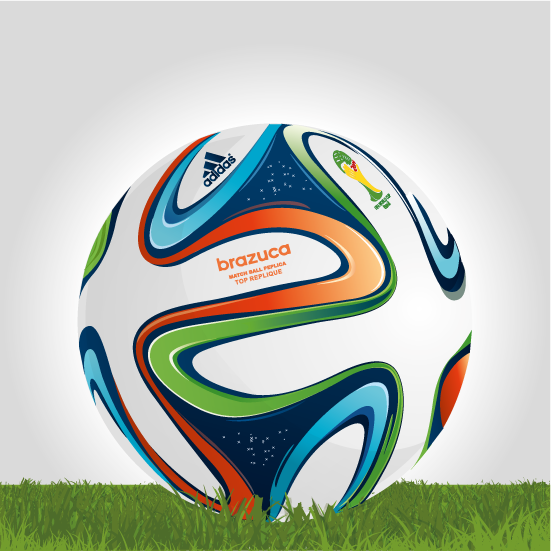
An artist illustration of Brazuka ball.
FIFA World Cup Poster Designs
This year we can see FIFA showing almost all of the World Cup Poster designs since 1930 before the first World War I.
[metaslider id=587]
Note: 1942 – 1946 not available, we stuck in World War II.
- Via: FIFA World Cup Timeline
Credit to: FIFA – owner of the World Cup and all of their registered and trademark properties.
Note: All FIFA images and file download links which are the property of FIFA was removed.