Lettering is a great option for a variety of design goals – from crafting an Instagram post to creating a memorable business card. It’s not as easy as writing something over a photograph in a photo editing software. You have to know the basics to create great-looking lettering design. Here’s how you start.
Start With a Grid
Think of your lettering design as a drawing, not a text. It’s what it is, essentially. So start designing it like a drawing.
Begin with a simple grid like this and flesh out the main elements of your design – the words. Think of each block as a word or a couple of words. Save smaller blocks for the functional words, and give the main words some room to breeze to make them stand out.
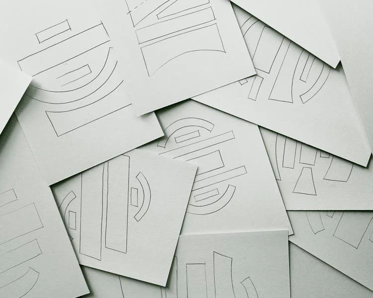
Source: Stefan Cruze
While the form in which you present your lettering may not influence the meaning of the phrase more than by the sheer size, it has to catch people’s eye. It’s these blocks that people are going to see first, not the words.
Work on making your composition visually attractive and eye-catching. Don’t just leave the blocks as they are. Stretch, rotate, and deform them to find the perfect form.
Visual Hierarchy
Once you’re done creating the composition, think about the visual hierarchy of your piece. The form of lettering may be difficult to read from the first look, so you have to prioritize certain words. In content creation, the job of professional writing services is to make sure that the text is easy to understand. In lettering, your job is to do the same thing, but visually.
You need to make sure the audience gets the message without having to read the whole sentence.
You might want to highlight only one word in shorter sentences, while longer ones may need more. For instance, if you have to find the main words in Gandhi’s quote “Happiness is when what you think, what you say, and what you do are in harmony,” you’d put a soft emphasis on the words “happiness” and “harmony,” and a bigger emphasis on the words “think,” “say,” and “do.”
You can make them stand out by choosing a different font type, size, and color. When placing the main words on your canvas, you need to make sure the whole sentence is readable, though. Otherwise, it may end up like this.

Not More Than Three Fonts
While it’s amazing that you’re ready to unleash your creativity, you shouldn’t get too carried away. If you place too many fonts on your lettering design, it can get pretty cluttered and hard to understand.
Try using no more than three fonts. Pick a basic font, a font for a soft emphasis, and a font for the main emphasis. They can be as different as you want them to be, but make sure you don’t use too many of them.
Work on Kerning
Kerning is the distance between the letters. You need to make it uniform to avoid breaking up a word visually. It’s a harder task than just finding the correct distance from the end of one letter to the beginning of the other.
The problem is that letters are very different, and kerning may appear the same on paper but look visually different. You have to make allowance for the problems with human perception when designing your lettering.
A common technique is to kern the letters upside down or in groups of three. This way, you can forget about the words and their meanings, and treat the letters as abstract shapes that relate to each other.
Add Visual Elements
Very few lettering designs can look stunning without additional visual elements. If you’re not trying to get a very minimalistic look, consider drawing something to compliment the lettering.
Source: Crashboomdesigns/Instagram
It can be as simple as these lines, or you can create a full-on drawing to serve as an underlayer for the lettering.
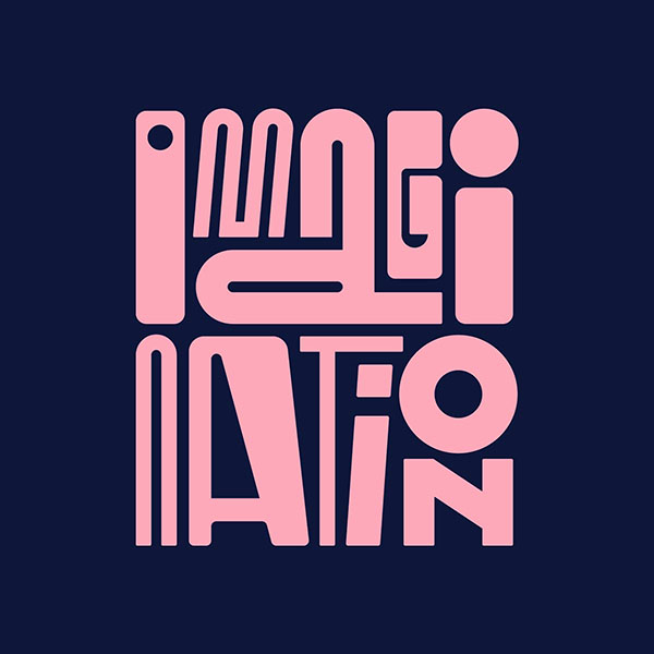
Get Creative With Artwork
You don’t have to focus your design on letters. After all, what you’re creating is essentially a drawing. So, why stop there? Get as creative as you want with the artwork you use.

Source: Really Good Emails
You don’t have to stick to the traditional fonts, either.
Source: Rafael Serra/Behance
Do You Have to Print?
Here’s the last tip. You may find it particularly useful if you’re creating lettering for printable materials. Working on printables and digital drawings is very different. You should start by switching to CMYK color code and leaving plenty of bleed on the edges of the picture. For more information, please, read this printing guide.
Conclusion
Creating great-looking lettering design is all about maintaining a balance between structure and creativity. You have to design a grid and fill it creatively with your phrase. Remember about the audience you’re working for and the purpose of the drawing, and you’ll receive great results!


One thought on “7 Letter Design Tips For Beginners and Pros”
Good blog you have got here.. It’s difficult to find good quality writing like yours nowadays.
I really appreciate individuals like you! Take care!!